By Charlotte Witts
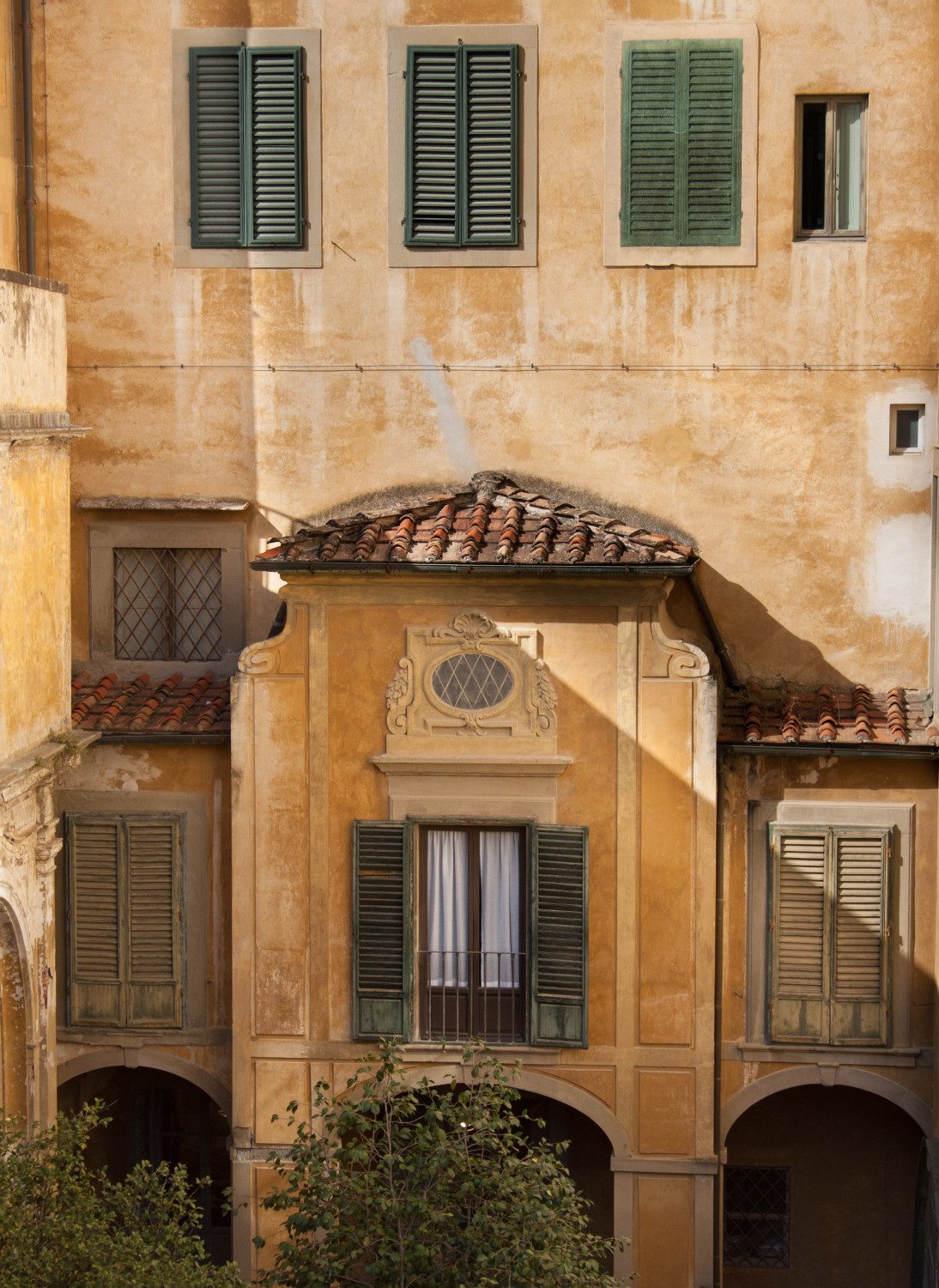
I was first introduced to the Tuscan colour palette accidentally. Having noticed me meticulously editing a picture of my home city, my high school photography teacher approached my desk. With great confidence in his voice, he stated ‘you would like living in Italy’. Without further elaboration, I was baffled at the comment. However, he continued to explain that I had edited the colour scheme of the photo to enhance the warm yellow ochres and oranges, inevitably resembling the buildings of
Italy, Florence in particular. Somehow, I had managed to transform the dismal rooftops of Birmingham into a place of radiance and beauty. The infamous city, which some would say to avoid, had lost its cloak of grey, bleak concrete and gained a golden tan. I had made it look inviting.